The Power of Color: How to Use Photo Editing to Change the Mood of Your Images
In the world of photography, the color in your photos plays a huge role in setting the mood and conveying the message you want to send. Whether you’re a hobbyist or a professional photographer, knowing how to change the mood of your images with colors can dramatically enhance the emotional impact of your photos. One of the easiest ways to do this is by using a colorful background photo editor. This tool allows you to switch the background color and achieve the desired vibe quickly.
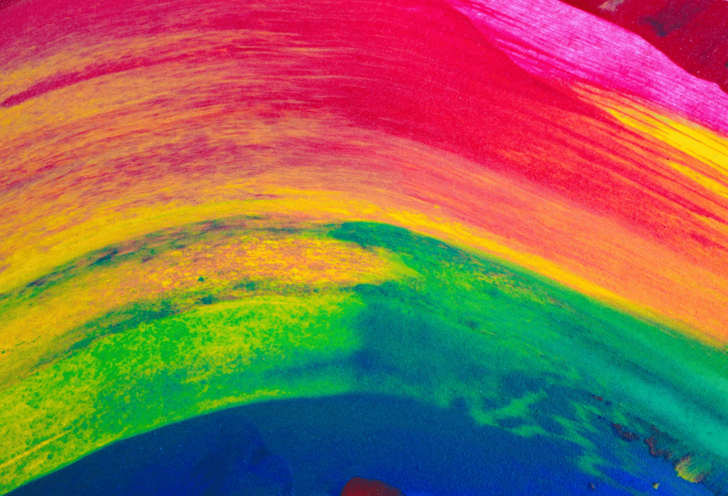
Understanding the Power of Color in Photos
Colors can speak louder than words. They can influence how we feel and react to an image. Imagine a serene beach scene with soft blue tones. It feels calm and peaceful, right? Now, picture that same scene with a bright red background. Suddenly, it feels energetic, intense, or even aggressive. That’s the power of color!
How Colors Affect Our Emotions
Colors have a profound impact on our emotions and can evoke specific feelings almost instantly. This is why color psychology plays such an important role in design, marketing, and even our personal mood. Whether we realize it or not, the shades surrounding us influence how we feel and behave. Here’s a deeper look at how different tones can make us feel:
- Red: Red is a color that grabs attention and often symbolizes passion, excitement, and urgency. It’s known to increase heart rates and create a sense of alertness. For example, red is commonly used in sales and promotional materials because it triggers excitement and encourages action.
- Blue: Blue is known for its calming effect. It is often associated with feelings of trust, serenity, and stability. Blue is widely used in corporate branding because it conveys professionalism and reliability. It’s also the color of the sky and sea, which can evoke feelings of peace and tranquility.
- Yellow: Yellow is often linked to happiness and positivity. It radiates warmth and energy, making us feel optimistic and cheerful. This color is great for adding a touch of joy to any image or design. However, too much yellow can be overwhelming, so it’s best used in moderation to keep the mood light and lively.
- Green: Green symbolizes nature, growth, and balance. It’s a color that promotes relaxation and calmness, making it perfect for creating a soothing atmosphere. Green also represents health and renewal, which is why it’s often used in wellness and eco-friendly branding.
- Purple: Purple is often associated with luxury, mystery, and creativity. It blends the stability of blue and the energy of red, making it a color that encourages imagination and a sense of sophistication. Purple is a popular choice for creative industries, luxury brands, and artistic endeavors because of its royal and mysterious undertones.
Colors are more than just aesthetic choices; they are tools of communication. As Lyndsey Drooby aptly puts it,
“Color can be used to soothe or to energize, to warn or to beckon.”
By understanding how each color affects our emotions, you can use them strategically to communicate a specific mood or message.
How to Use Color to Change Your Image’s Mood
Changing the background color of an image can drastically alter the entire atmosphere of the photo. Whether you’re editing a portrait, a landscape, or a product shot, adjusting the background color helps you align the image with the intended mood or message.
Bright colors like yellow, red, and orange can add excitement and energy to a photo. If you’re editing a photo of someone playing sports or at an event, a bright background can emphasize the action and create a sense of movement.
Soft pastel colors or gentle shades of blue and pink can create a calm and relaxed atmosphere. These are perfect for portraits, family photos, or any image where you want to evoke feelings of tranquility and warmth.
For business photos or professional images, neutral backgrounds like white, grey, or black work well. They keep the focus on the subject while still providing a sleek, polished look.
Tools to Help You Change Background Colors
Changing the background color of your images has never been easier, thanks to the variety of photo editing tools available today. With just a few clicks, you can transform the mood of your image and create stunning visuals that stand out.
In recent years, artificial intelligence (AI) has also stepped into the photo editing scene, offering smart tools that can automatically detect the background and allow you to change it with impressive accuracy. These AI-powered editors are designed to simplify the process, making it faster and more intuitive. You don’t need to be a Photoshop expert to use them—just upload your photo, select the background color you want, and let the tool do the heavy lifting. Many AI-based editors also allow for fine-tuning, enabling you to adjust the background hue to your liking.
One great example of an easy-to-use tool is the Creative Fabrica Background Color Changer. This tool lets you effortlessly change your photo’s background to any shade you desire, offering a range of customizable options to ensure your image looks perfect. Whether you’re working on a personal portrait, an event photo, or a business image, these tools can help you achieve professional results in just a few minutes.
Tips for Choosing the Right Color for Your Photos
Not every color works for every image. It’s important to choose colors that complement the subject of the photo and convey the right feeling. Here are some tips:
- Consider Your Subject: If you’re working with a portrait, the background color should enhance the subject without overwhelming it. For example, if your subject is wearing bright clothes, a neutral or soft background will make them stand out more.
- Think About the Message: If you’re editing a photo for a specific purpose, like advertising or marketing, think about the message you want to send. Bright, energetic shades may be great for a fitness ad, while calm, muted tones might work better for a luxury brand.
It’s also helpful to consider the context in which the photo will be used. If it’s a social media post, a vibrant, attention-grabbing color could be perfect. On the other hand, if it’s for a more formal setting, like a business website or product catalog, subtle, elegant tones may be the way to go. Experiment with different shades to find the right balance and always keep the overall tone of the photo in mind.
Conclusion
Changing the background color of a photo may seem like a small detail, but it can have a huge impact on how the image is perceived. Whether you’re looking to energize your photos with vibrant colors or create a calm, professional vibe with neutral tones, photo editing gives you the flexibility to enhance the mood of your images.